Responsive Design
Go for a mobile friendly website to gain more business….
According to Google survey….
- 67% of users are likely to buy products or services in mobile friendly sites
- 74% of users are likely to revisit a website if the site is mobile friendly
- 61% quickly like to leave the site if it is not mobile friendly
The use of mobile devices to surf websites is growing at an enormous pace, but most websites are not optimized for such mobile devices. There is a constraint of display size on mobile devices, as a different approach is required on how the content is laid out on mobile screens. An array of screen sizes are available these days, across phones, tablets and desktops. With newer inventions everyday, screen sizes will keep changing, so it is important that your website adapts to all kinds of screen sizes.
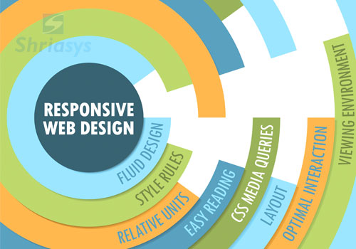
Responsive web design changes the appearance of a website dynamically, depending on the screen size of the device being used. The technology uses breakpoints to determine how the layout of the website will appear, one design is used above and another below that breakpoint. The breakpoints are usually based on the width of the browser.
Kindly see our website portfolio - Our work speaks for itself.