Responsive Web Design That Fits Every Screen
At Shriasys, we craft websites that adapt flawlessly to mobiles, tablets, and desktops.
Responsive Web Design
Delivering Seamless Experiences Across All Devices
In today’s digital world, your audience browses on desktops, tablets, and smartphones. A website that isn’t mobile-friendly risks losing valuable visitors and search visibility.
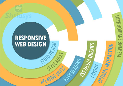
With Responsive Web Design, your website automatically adjusts to desktops, tablets, and smartphones, ensuring a smooth and engaging experience for all users. At Shriasys, we specialize in creating responsive websites that combine performance, usability, and visual appeal.
Why Responsive Web Design Matters
Better User Experience
SEO and Search Visibility
Google prioritizes mobile-friendly websites in search rankings. A responsive design directly contributes to higher visibility in search results and reduces bounce rates, both of which strengthen your SEO performance.
Cost-Effective and Scalable
Our Approach
- Mobile-First Development – We design for mobile screens first, then scale up for larger displays.
- Fluid Layouts & Flexible Grids – Content adjusts dynamically with flexible units and smart layouts.
- Optimized Images & Media – Fast-loading visuals for all devices with adaptive scaling.
- Cross-Browser Testing – Your site looks great on Chrome, Safari, Firefox, and Edge.
- Performance Focused – Lightweight code and responsive elements for speed and usability.
Key Features You’ll Get
- Clean, modern UI tailored to your brand.
- Flexible webpage layouts for desktop, tablet, and mobile.
- Interactive elements that work smoothly everywhere.
- Accessibility standards for all users.
- Integration with CMS platforms like WordPress or custom builds.
Why Choose Us?
At Shriasys, we’ve been delivering professional website designs since 2002. Our team combines creativity, technology, and strategy to build responsive websites that not only look beautiful but also drive results.
We focus on building responsive websites that are:
- Visually appealing and brand-focused.
- Structured for performance and fast load times.
- Aligned with digital marketing and SEO strategies.
- Designed for measurable business growth.
Whether you need a redesign or a brand-new site, we create digital experiences that engage users and grow your business.
Ready to Go Responsive?
Shriasys is a Responsive Website Design Company committed to delivering aesthetically pleasing and highly functional websites that capture the essence of your brand. Our design process focuses on creating visually engaging layouts that offer an intuitive user experience, ensuring your visitors are drawn in and stay longer.
Quick Links
Contact us
-
Shriasys
304, G.V. Residency
Sowripalayam Post
Coimbatore - 641028
Tamil Nadu, India.
-
Email