- |
-
Malathi
Your website’s navigation isn’t just a menu—it’s the roadmap that guides visitors toward taking meaningful actions such as signing up, purchasing, or contacting your business. Poor navigation can confuse users, increase bounce rates, and directly lower conversions. On the other hand, a well-structured navigation system improves user experience, reduces friction, and leads users smoothly toward your conversion goals.
This guide breaks down proven strategies to design navigation that not only looks clean but is engineered to boost conversions.
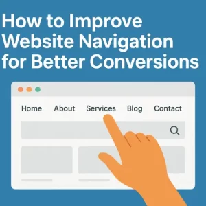
What Makes Navigation Conversion-Friendly?
Great navigation should:
Help users find information quickly and effortlessly
Reduce cognitive load with clear structure and wording
Encourage visitors to follow strategic paths (e.g., pricing → contact → checkout)
Improve engagement and time on site
Build trust through clarity and transparency
When users don’t have to think about how to use your website, they are more likely to convert.
Key Strategies to Improve Website Navigation
1. Keep the Primary Menu Simple and Intent-Driven
A cluttered menu overwhelms users and reduces decision-making clarity. Limit top-level items to 5–7 key pages, focusing on what drives conversions.
Better approach:
- Use concise page labels (e.g., Services, Pricing, Portfolio, About, Contact)
- Place less crucial links in footer or secondary menus
- Use a logical hierarchy with clear parent-child relationships
2. Use Clear, Descriptive, Action-Oriented Labels
Avoid generic words like “Learn” or “Products.” Users should instantly understand what’s behind each link.
Examples:
| Weak Label | Improved Alternative |
|---|---|
| Services | Digital Marketing Services |
| Products | Shop Men’s Footwear |
| Learn | Explore Tutorials |
Clear labels increase clicks because users feel confident about where they’re going.
3. Add a Site Search — Especially for Content-Heavy Websites
If your site has blogs, tutorials, or many product pages, a search bar is essential.
Benefits:
Helps users find pages faster
Reduces drop-offs when users don’t see what they want in menus
Improves UX for returning users
Make it visible in the header or sticky menu.
4. Optimize Navigation for Mobile Users
Over 60% of users browse on mobile—so navigation must work flawlessly on smaller screens.
Best practices:
Use a collapsible hamburger menu or bottom nav bar
Ensure tap targets are spaced well (no accidental clicks)
Make CTAs sticky for thumb-reach accessibility
Mobile navigation should feel natural, not forced from desktop design.
5. Use Sticky Navigation to Keep Key Actions Visible
Sticky headers ensure users can always access:
Menu items
Search
CTAs like Call Now, Get Quote, Book Demo
This reduces friction and increases conversions, especially on long-scroll pages.
6. Include Conversion-Focused CTAs in the Menu
Your navigation should not only help users browse—it should drive action.
Examples of navigation CTAs:
Get a Quote
Start Free Trial
Book Consultation
Request Demo
Make them visually distinct using color contrast or button styles.
7. Implement Breadcrumbs for Better Orientation
Breadcrumbs help users understand where they are within the site, especially on:
- E-commerce product listings
- Blog categories
- Multi-step funnels
They also help SEO by improving internal linking structure.
8. Use Visual Hierarchy and Icons
Visual cues make navigation easier to scan.
Ways to improve clarity:
- Icons beside menu items
- Larger font size for primary links
- Weight and color variations to guide eye flow
- Hover effects for link states
These subtle enhancements reduce friction and improve usability.
9. Use Analytics & A/B Testing to Refine Navigation
Navigation is not a one-time setup—it must evolve.
Tools to evaluate performance:
- Google Analytics (navigation path & exit points)
- Heatmaps (Hotjar, Microsoft Clarity)
- A/B tests on menu structures and labels
Data-driven refinement ensures UX stays aligned with user behavior.
10. Personalize Navigation Based on User Journey
Different users need different paths.
Examples:
- Show “Continue Shopping” for returning customers
- Highlight “Book a Call” for first-time B2B visitors
- Tailor content based on location or device
Personalization increases conversions by aligning navigation to intent.
Navigation Strategies by Website Type
| Website Type | Recommended Navigation Approach |
|---|---|
| E-Commerce | Mega menu, filters, category-based nav, sticky cart |
| Service-Based / Agency | FAQ, Services, Portfolios, Pricing, Lead CTAs |
| Blogs/Content Sites | Category menus, search bar, tags, breadcrumbs |
| SaaS / Product Websites | Pricing, Demo, Docs, Integrations, Onboarding links |
Conclusion
Navigation isn’t just a UX element—it’s one of the strongest levers for driving conversions. By simplifying your menu, clarifying labels, adding mobile-first navigation, and strategically placing CTAs, you guide users effortlessly toward meaningful actions.
A well-designed navigation system builds confidence, reduces friction, and ultimately converts more visitors into customers.