- |
-
Malathi
Typography has evolved far beyond selecting fonts that “look good.” In modern web design, typography is a strategic layer that drives usability, strengthens brand identity, and improves the overall digital experience. As users interact with websites across diverse devices, resolutions, and accessibility needs, type choices must balance aesthetics with function, performance, and emotional impact.
Here are the key typography trends shaping modern websites in 2025—and how designers can use them effectively.
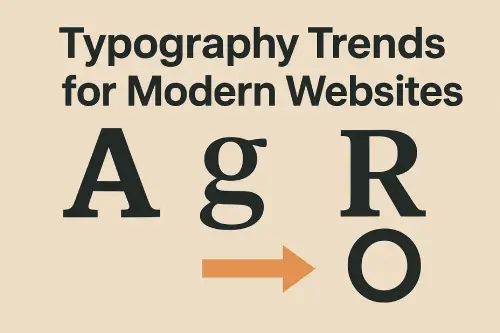
1. Variable Fonts Driving Flexibility and Performance
Variable fonts have officially moved from “emerging technology” to mainstream adoption. A single font file can now behave like multiple weights, widths, and styles—reducing load time and enabling smoother UI transitions.
Why this trend matters
Reduces total font load by up to 70%
Enables responsive typography without loading separate font files
Allows micro-animations such as weight shifts on hover, scroll, or interaction
Offers designers granular control over the tone of a page
How to implement
Replace traditional font families with variable versions when available
Use CSS custom properties to animate font weight or width
Test performance impact across devices, especially mobile
2. Bold, Oversized Headlines for High-Impact Visual Hierarchy
Modern websites are leaning toward strong, oversized headlines that command attention. With shrinking attention spans, bold typography becomes a primary visual anchor.
Why this trend works
Instantly communicates tone and hierarchy
Works well with minimalistic layouts
Enhances scannability, especially on mobile
Best practice
Pair oversized type with generous white space
Avoid using decorative or overly heavy fonts for large headings
Ensure contrast meets WCAG AA for readability
3. Neo-Serif and Editorial-Style Typography for a Premium Feel
Brands are pushing beyond traditional sans-serif dominance and embracing modernized serif fonts to add personality and sophistication.
Characteristics
High contrast strokes
Sharp, refined serifs
Editorial and magazine-inspired layouts
Where it works best
Lifestyle brands
Luxury products
Blogs, publications, and long-form content
4. Humanist Sans-Serif for Friendly, Accessible UI
With accessibility becoming a design standard, not a feature, humanist sans-serif fonts are gaining traction. They improve readability and deliver a friendlier user experience.
Why designers choose them
Clear letterforms enhance legibility
Work well in small text sizes
Feel modern, minimal, and clean
Ideal use cases
Navigation menus
App interfaces
Body text in content-heavy websites
5. Typographic Gradients and Color Treatments
Typography is becoming more expressive through color transitions, soft gradients, and tonal overlays—especially in hero sections and landing pages.
Benefits
Creates visual interest without heavy graphics
Supports brand-driven color stories
Modern aesthetic suitable for tech and creative brands
Implementation tips
Use gradients sparingly—avoid difficult contrast
Ensure text remains readable on all screen types
Limit gradient use to headlines or display text
6. Kinetic and Animated Typography
Micro-animations in typography—subtle fades, scaling, tracking shifts, or strokes—are now a core part of modern interaction design.
Why it’s trending
Enhances storytelling
Guides user attention
Creates a dynamic first impression
Use it carefully
Keep animations under 0.3–0.5 seconds
Never animate body text
Maintain accessibility by ensuring motion is subtle and optional
7. Minimalistic, Content-Centric Typography
As websites simplify layouts, typography becomes the primary design element. A clean, minimalistic type system creates a professional, uncluttered atmosphere.
Characteristics
Generous spacing
Restrained color palettes
One or two typefaces maximum
Benefits
Faster loading
Easier content consumption
Consistent cross-device experience
8. AI-Assisted Typeface Pairing and Layouts
AI tools are assisting designers with type pairing recommendations, spacing, readability checks, and responsive scaling.
What AI helps with
Selecting complementary font pairs
Automatically adjusting vertical rhythm
Validating accessibility and contrast
Predicting readability on different devices
AI doesn’t replace the designer—it accelerates precise typographic decision-making.
Final Takeaway
Typography has become one of the most influential elements in modern web design. Today’s trends focus not just on aesthetic appeal but on performance, clarity, accessibility, and brand impact. Incorporating these typography strategies helps designers create websites that feel current, polished, and user-centric.